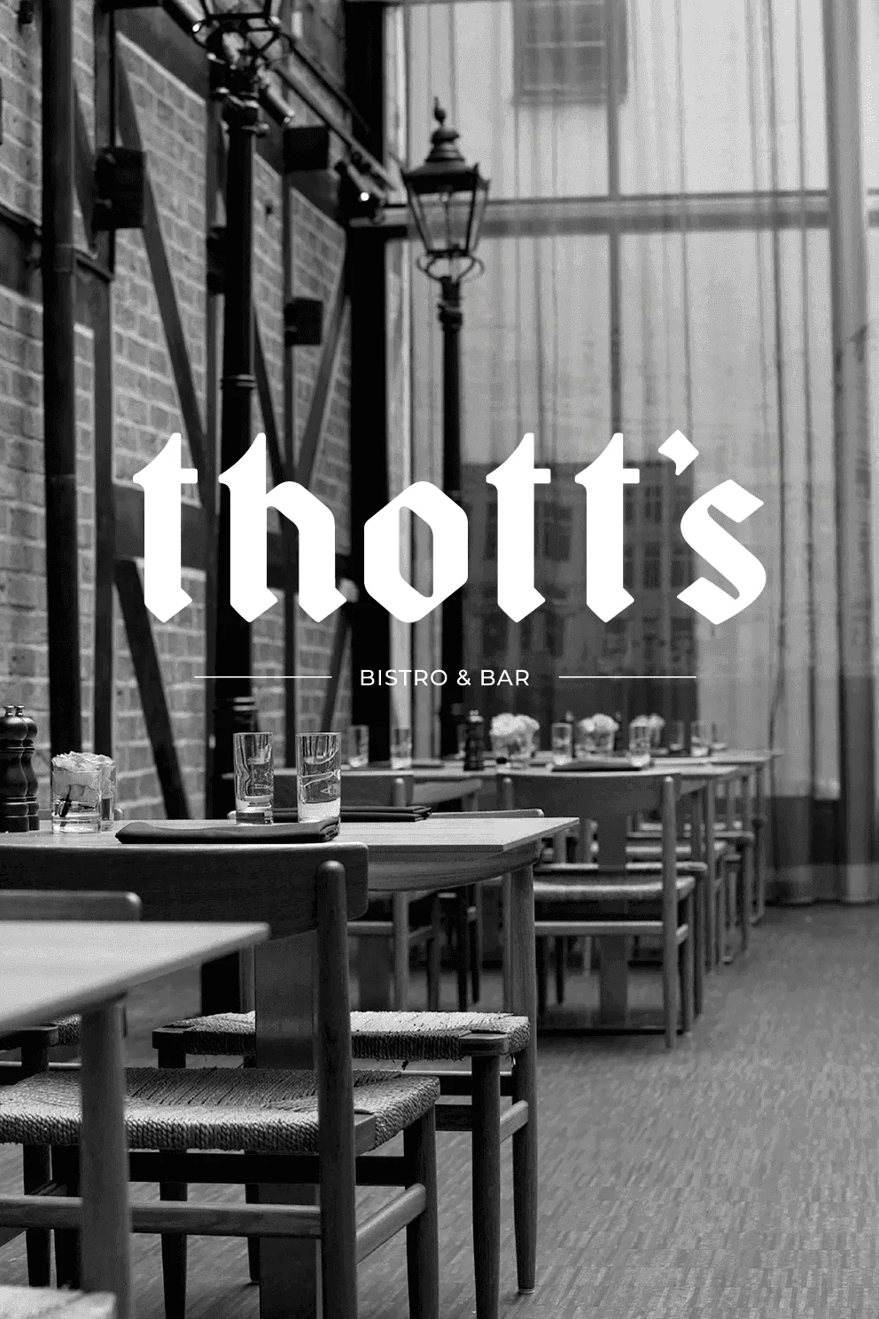
Thott’s is a branding project based on Thott’s restaurant, located in a 16th-century half-timbered house in Malmö. The project explores how a visual identity can bridge historical architecture and modern communication. The challenge was to create a brand that honors the building’s cultural heritage while engaging a contemporary audience.
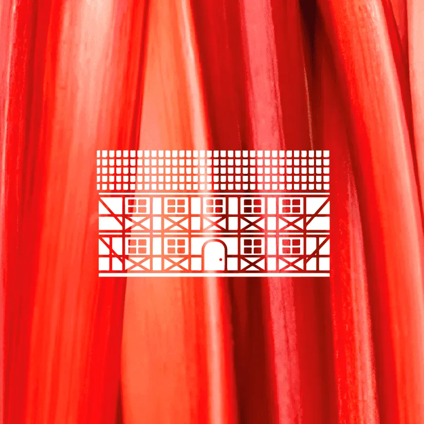
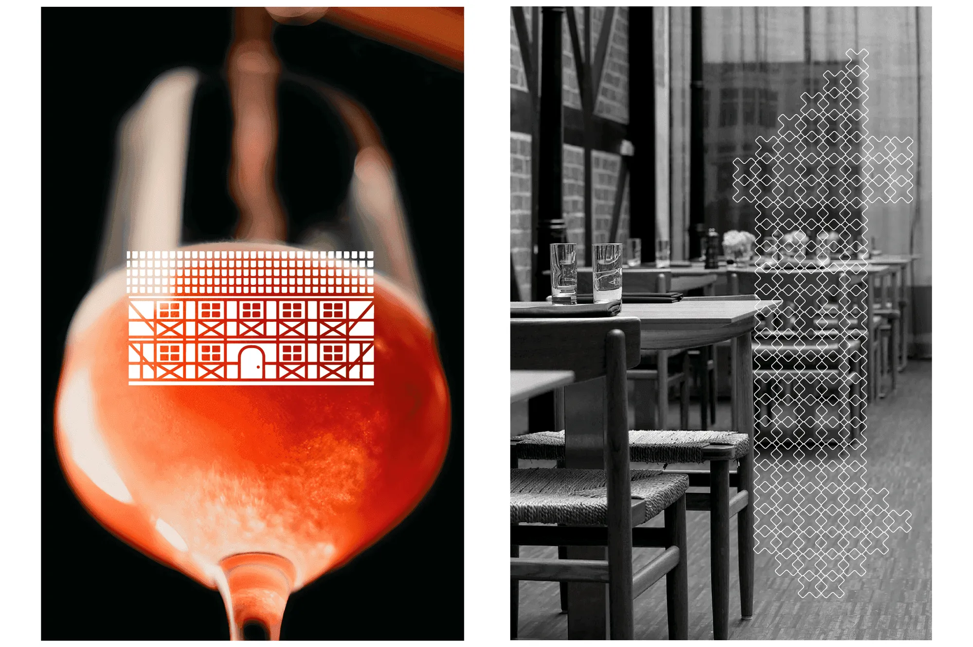
The logotype features a custom Fraktur-style typeface referencing 16th-century Scandinavian printing. To create contrast, a sans serif typeface is added, giving the identity a contemporary balance. The visual identity includes two symbols. One is based on the preserved timber-framed facade of the house, emphasizing the building’s architecture through a simplified, modern form. The other is a stylized “t” constructed from a cross-shape inspired by timber-frame structures. To show the identity in use, the project includes menus, coasters and campaign materials.